👁️The science of visual hierarchy
Control where people look 👀
👁️When scientists track peoples’ eye movements as they look at a good design (vs. a bad design), in the good design people will look at the same elements in a similar order 📄.
Designers call this visual hierarchy. Scientists call this visual salience.
Here’s what science knows so far about controlling eye movements with design…
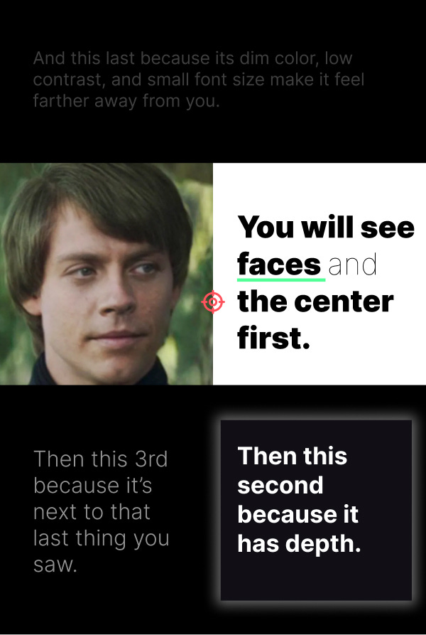
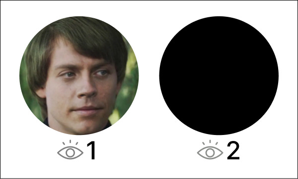
1. Faces are likely to be noticed early
Remember that we have a dedicated system in the brain for processing faces 📄.
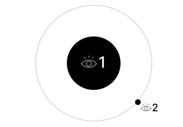
2. The Center of a design is seen earlier
This is called the center bias 📄.
3. Depth cues: Objects that feel closer are noticed earlier
…which could also account for big things being seen before small things 📄.
4. Local contrast: Objects that are different from their immediate surroundings pull focus.
The old adage “your eyes go where there is the most contrast” holds up extremely well scientifically. Many predictive eye tracking algorithms are designed primarily to detect local contrast 📄.
5. Attentional templates: You look where you've had success looking before.
…the popular Z, F, and Layer-cake scan patterns could probably be called generalized attentional templates 📃.
Practical takeaway: Combine multiple salience factors to create a functional hierarchy.

State of the science: Visual salience factors may be processed in parallel, and science doesn’t fully understand yet which factors are more/less powerful (e.g., depth cues or local contrast?). So when in doubt, combine multiple salience boosters (e.g., a face in the center).
Who cares: People may be able to process a stronger visual hierarchy faster, likely lowering cognitive load 📄.
👨🔬How to rabbit-hole: Try searching Google Scholar for visual salience factors or scanpath prediction. Tell me what you find!
P.S. - This is my first real issue of UX Scientist. How’d you like it?


